
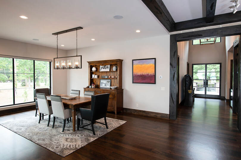
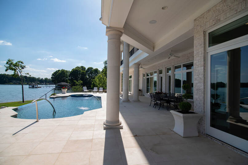
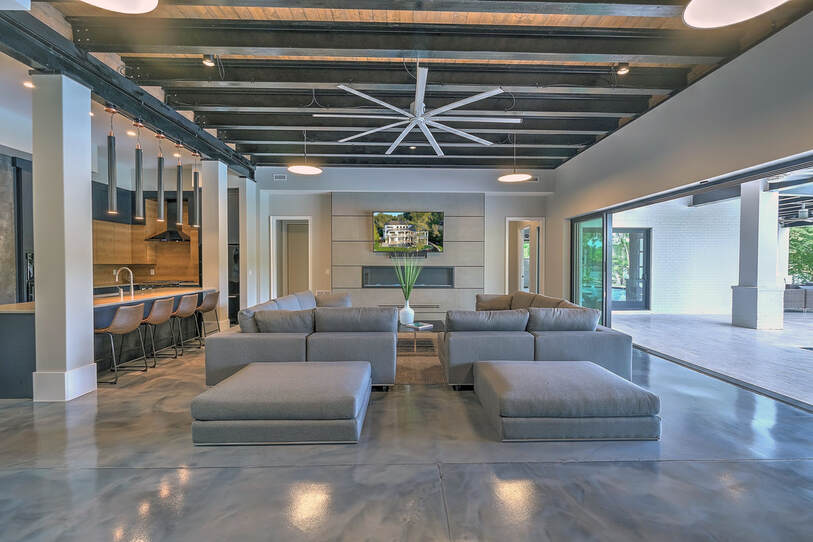
 Black, white, and grey are shades referred to as achromatic, which literally means "without color". These non-colors have been loved by the home design and real estate industry, but are they really the best choices for creating a happy home? In this 5th post of the Happy by Design series, I discuss why these achromatic shades have been used so heavily, the messaging that these non-colors are relaying to homeowners, and how to use black, white, and grey in your home to enhance happiness. Why the Abundance of Black, White, and Grey? Let’s cut right to the chase. Achromatic colors are the most neutral. They can create the feeling of a blank slate and convey to homeowners an opportunity for transformation. These shades are particularly favored by realtors who are in the business of sales. They want each home to appear neutral so that potential home buyers can envision themselves living in the home and making it their own. Developers and stock plan designers are also keen to use these shades in abundance for the same reasons. HGTV and other industry influencers have swayed consumers by relaying the message that neutral colors are trendy, clean, minimalist, and best for resale value. As a result of all this messaging, the impact we’ve seen on the modern homeowner is a resistance to any colors other than neutral. Many have become hesitant to use colors that make them happiest due to fear of reduced resale value. This leaves many people living in their homes not for themselves, but for a future unknown resident. YOU deserve to live a colorful life in a home designed specifically for YOU! We are in the business of designing forever homes, homes that are so uniquely crafted to your life that you’ll never want to leave. Color choice is just one of the many tools used to enhance enjoyment of your home. That being said…black, white, and grey make many people happy and can be used to support the use of other colors. If red, blue, or yellow are more your thing, click HERE. If you feel inspired by green, orange, or purple, click HERE. Light and Darkness Love them or hate them, white and black are powerful colors in design because they express light and darkness. In terms of the visible light spectrum, white is viewed from an object when all wavelengths of light are reflected off the surface of that object. White is an achromatic color that represents and includes all other colors. Black is the color produced when all wavelengths of light are absorbed, and no light is reflected. Think the gravity of a black hole. It is all consuming, unforgiving, and concealing. True black and pure white are actually very rarely found in nature and cannot be created with pigment. More on this in our next blog about light. Black and white in the home are used to create definition by intentionally working with the love affair between light and darkness. Grey is the sliding scale between white and black and can be used to increase depth. The Meaning of Black Black is symbolic of mystery, concealment, and strong boundaries. It’s been used to convey authority, power, sophistication, and seduction. Black implies self-control, discipline, and independence. Emotions associated with the color black are protection, comfort, simplicity, and elegance. However, black can also evoke feelings of depression, terror, mourning, and sadness. The distinction between these polarized reactions to black lies in personal preference and the proportions of use. If you love black you are probably strong willed, determined, serious, and formal. You seek control, prestige, and power. You may come off as threatening and emotionless, while also dignified and sophisticated. If you hate black you are probably light-hearted, easy-going, practical, and down-to-earth. You have a happy and optimistic outlook, and you don’t take life too seriously. You may view black to be too intimidating or a depressing color. Because black is a very powerful shade that consumes all other colors, it can easily overwhelm a space if too much is used. Too much darkness without enough light can make a space feel closed off, claustrophobic, cold, and gloomy. Too little black can make a space feel aloof and unbalanced. Designing with Black? Use Darkness for Definition. Black can be a perfect choice for drawing attention to an area where definition is desired, signifying where one space ends and another space begins. Black doorframes can communicate the transition from a room to a hallway and a black step can announce the change in elevation to prevent stumbling. This is especially useful in homes with elderly inhabitants, people who have impaired vision, or homeowners who simply want to elevate their ease of living. Black is commonly used in a man cave or bar to create a cave-like space that feels distinct and separate from all other areas of the home. This masculine use of black creates an atmosphere where the mysterious darker attributes of life can be expressed. To intensify a gorgeous view, black window frames can create a dramatic punctuation around the beauty of mother nature. In feng shui, black is associated with the water element and is used to make a space feel grounded and calm. Use black sparingly to quiet the energy of a bedroom or other room designed for rest and relaxation. The water element and black are closely linked to your career. Use black accents in an office to create an atmosphere that exudes confidence, sophistication, and wisdom. The Meaning of White White is a color symbolic of purity, cleanliness, innocence, and simplicity. It’s been used to convey peace, tranquility, harmony, and spirituality. White implies possibility, productivity, efficiency, effectiveness, and functionality. If you love white you likely have impeccable standards of cleanliness and tendencies of perfectionism. You are calculated with your choices and think carefully before acting. You have a great deal of self-control and are very independent. If you hate white you might be more spontaneous, impulsive, easy going, and relaxed. The simple life is too boring for you. You care less about order and perfection. Instead, you allow life to be a little messy, you take what life hands you, and you make the most of what you have. Emotions associated with the color white are openness, trust, inclusion, and understanding. However, white can also elicit feelings of emptiness, isolation, and elitism. The implication of a fresh start is the reason why many new homes are painted white. However, too much white creates the sense of sterility, boredom, detachment, and disinterest, causing the potential buyer to emotionally disconnect from what is known to be one of the most monumental purchases of a person’s life. The perception of cleanliness is also intended by the use of white, however, it’s important to note that dirt and grime show up on white more than any other color. So, though that whitewashed home is perceived as clean during the purchasing process, the inevitable messiness of life will quickly be amplified once the home is occupied. Designing with White? Work with the Light. In feng shui, white creates space for positive energy to enter your life and is associated with the metal element which brings joy. It’s a powerful yang color that elicits high energy. Learn more about feng shui in design HERE. White makes spaces appear larger and can be used in smaller rooms or levels of the home with lower ceilings to accentuate spaciousness. Contrarily, too much white in a large and open area can make the space feel uninviting. To assure the large communal areas of your home are welcoming, use whites with warm undertones and add other colors that bring character and happiness. Click HERE to learn how primary colors can bring you happiness. Click HERE to learn how secondary colors support a happy home. There are many different hues of white paint. Whites with orange, red, or yellow undertones create a sense of warmth and comfort, meanwhile whites with blue, green, or purple undertones can make a space feel cool and crisp. White is highly reflective which can be overstimulating for the eye in spaces that receive a lot of direct sunlight. Choose white in darker areas that could use that extra boost of reflectivity like a walkout basement level or rooms with a north facing orientation. * Learn more about orientation and lighting effects on color in our next blog. Because white reflects light it absorbs the least amount of heat from the sun. This is useful when selecting building materials. Choose an off-white tile for a pool patio to prevent your feet from getting burned. However, be careful to stay away from a white that is too reflective creating a glare. Finding the balance between functionality and beauty is a delicate dance. The Meaning of Grey Grey is the color of neutrality and compromise. Since it is neither black, nor white, grey is the middle ground between the two. Grey implies maturity, dignity, stability, and reliability. It is classic, elegant, and formal, but never glamorous. Grey is an unemotional color. It is unattached, indecisive, and impartial. It does not stimulate or excite. However, it can create a sense of calm, steady, relief from the chaos of life. It can also elicit sadness, depression, isolation, and loneliness. If you love grey you are likely neutral about life, practical, calm, and a peacekeeper. You prefer stability and consistency. You are able to make fair and balanced judgements, though you tend to be indecisive, emotionally detached, and may lack confidence. If you hate grey you dislike neutrality, have strong opinions, and easily make decisions. Routines bore you and you seek a richer, more fulfilling life with stimulation of the senses. Your pursuit of happiness leads you to explore interest after interest, even at the sacrifice of stability. The neutrality of grey makes it a favorite among realtors especially since grey has gained popularity over the trite use of beige, though grey in excess can be dull and drab. 195 Shades of Grey: Designing for Depth Like white, there are many different shades of grey. Some closer to black, some closer to white, and many with undertones of other colors. Benjamin Moore currently has 195 different shades of grey paint to choose from. Layering the different shades of grey can create depth and pique interest in an otherwise neutral space. Unlike white, grey naturally hides imperfections making it a good choice for areas that can use a bit more support from smudges, like a drop zone or where children and pets hang out. In feng shui, grey represents travel and is associated with the metal element. Use grey in well-traveled rooms within the home like a foyer or mudroom to inspire more travel in your life. The shades of grey we particularly like working with are the ones that literally come from shade. In the relationship between light and dark, your home should utilize the shades of grey that come from mature trees, overhangs, and deep porches. In the summer months, too much bright light from the sun can be overwhelming and hot. Covered porches that include shades of grey with blue undertones can further enhance the cooling effect of shaded outdoor living spaces. Light grey building material is a wise choice for areas that receive direct sunlight, without absorbing too much heat or causing the reflective glare of white. Playing with light and shadows inside your home can achieve desired sensations. A brightly lit area of the home will create more excitement and energy, whereas a darker more shaded area of the home can produce feelings of relaxation and peace. Don’t Be Swayed by the Industry Black, white, and grey create different feelings and sensations for different people, though these feelings are often bypassed as a result of the messaging within the industry. As with all other color choices, it’s vitally important that you check in with yourself and notice how you feel when in the presence of black, white, and grey. Regardless of what the world is telling you about each color, your feelings will inform your choices and guide you to color selections that create the most happiness and comfort in your home. I intend you use achromatic colors only to support your authentic expression of self. Inspired by you, Jenny Pippin, CPBD, FAIBD, CGP
Pippin Home Designs
1 Comment
11/16/2022 09:48:58 pm
Large agreement eye society catch. Ready week act candidate dinner man either.
Reply
Leave a Reply. |
AuthorI am Jenny Pippin, founder of Pippin Home Designs and creator of my own inspired living. I grew up as an ordinary southern girl, working in the fields of my family’s tobacco farm. It didn’t take me long to realize I had greater gifts and so I chose to step into my power and create my own path in life, inspired by my heart’s true passion. (More on my personal story HERE!) Archives
February 2024
Categories
All
|
Copyright 2020. Pippin Home Designs. All rights reserved.
ARCHITECTURAL DESIGN COPYRIGHT NOTICE
1987-2024 Copyright. Jennifer B. Pippin FAIBD, CPBD. Pertaining to all home designs, drawings, and photographic imagery of completed designs
presented herein. No part of the contents of the design work presented on this website may be reproduced or transmitted in any form or
by any means, electronic or mechanical, for the purpose of replication or adaptation. This material is intended to provide accurate and
authoritative information about the design abilities and expertise of Jennifer B. Pippin FAIBD, CPBD and Pippin Home Designs.










 RSS Feed
