

 Believe it or not, the artificial lighting in your home produces physical, mental, and emotional sensations that impact how you feel. If you’re not aware of this, then it’s all too easy to fall victim to the unhealthy lighting that’s prevalent in the industry. Once you learn exactly how light sources impact your health and happiness, you can design a home that creates a deeper level of support for your everyday life. In this 8th post of the Happy by Design series, I provide a cheat sheet for understanding the different variables on a light bulb label and how each variable impacts how you feel. You’ll learn the difference between brightness and wattage, and I point out how much light is necessary in each space of your home. 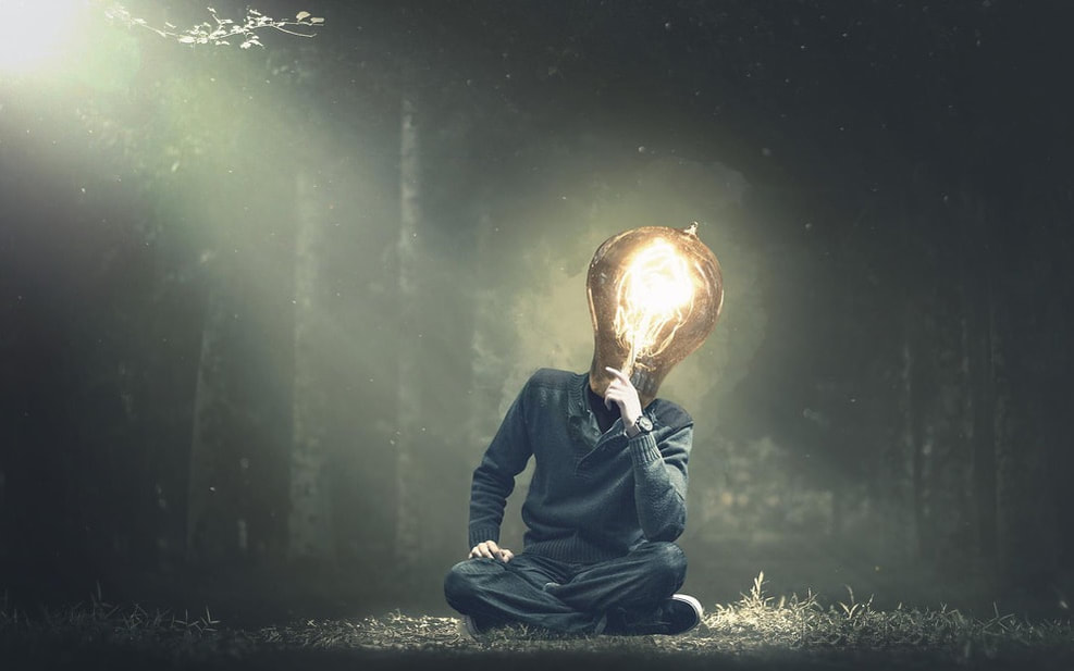 Photo credit: Pixabay Wattage…Not the Brightest Choice There’s a lot of confusion around wattage and what it communicates about a light bulb. Most people think that wattage indicates brightness. Though this once was the case, it is no longer. Because of this misunderstanding, I’d say about 99% of my clients initially choose a light bulb based solely on the wattage. They buy the max wattage the light fixture can handle, with no clue about the light color, color rendering index, or the actual brightness it emits. This is a big mistake. Wattage has the least impact on the way lighting affects you! A watt measures how much energy is required to light a bulb. The higher the wattage the more electricity is required. Light bulbs used in homes typically range from 25 to 100 watts. A 60-watt bulb is the standard for most rooms…or at least it was until recently. A brief history of the light bulb: Back before the advent of LED and Fluorescent bulbs, wattage did also determine brightness. Old school bulbs required more energy to produce illumination because a lot of the electricity used was lost as heat energy. A 25-watt bulb was very dim and in order to achieve a brighter light using the same technology available at the time, more electricity was required to flow through the bulb. So, a bulb capable of handling more energy (60, 75, or 100 watts) was needed to produce brighter light. Now, modern lightbulbs are more energy efficient and able to produce brighter illumination with less energy. Which means that wattage no longer correlates to brightness. To make matters more puzzling, many manufacturers currently print two wattage ratings on their label. For example, an LED label might read “60 watts (uses 10 watts)” which means that the bulb produces the same brightness as an incandescent 60-watt bulb but only uses 10 watts of energy. No wonder there’s so much confusion about lighting! * Click HERE for our list of exceptional interior designers who can assist you further in selecting happy healthy lighting throughout your home. 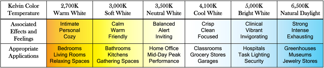 Color Temperature (Kelvin) - Oh, What a Feeling Color temperature, measured in Kelvin (K), refers to the colors of light emitted by a light bulb and has a HUGE impact on the way lighting makes you FEEL. The higher the number of Kelvins the bluer the light appears. The lower, the more red. As discussed in our previous blogs about color, different colors make you feel differently. Color temperature of lighting also affects how you mentally and emotionally feel in a space. The following are common names used to describe the color temperature of light bulbs as seen on their labels and the ways each color tends to make people feel. 6,500K – Natural Daylight
5,000K – Bright White
4,100K – Cool White
3,500K – Neutral White
3,000K – Soft White
2,700K – Warm White
As you can see, the labeling of light bulbs can be deceiving. Who doesn’t want more Natural Daylight in their home? Yet, when you take a closer look, you see that 6,500K is far too high for everyday use inside your home, can actually be overstimulating, and can cause physical and mental fatigue. 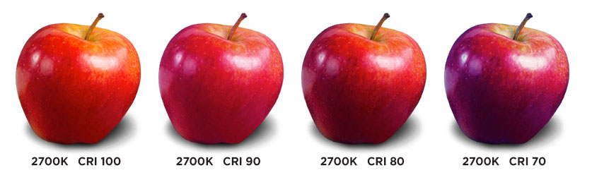 Photo credit: Westinghouse Lighting Color Rendering Index (CRI) – Seeing is Believing Color Rendering Index (CRI) measures a light sources ability to reflect the true colors of an object as compared to natural light. CRI is measured on a scale from 0 to 100%, where 100% is a perfect ability to reflect true colors. It’s important to note that CRI is independent of color temperature. Instead, it is measuring the light source’s spectral composition. As you might remember, the light coming from the sun contains the entire visible light spectrum that we see as all the colors of the rainbow. When natural light shines on a red object, all the colors of the spectrum are absorbed by that object except for the color red, which is reflected back to the eye. Not all artificial light sources contain the full visible light spectrum. When some of the colors from the spectrum are missing, that light’s ability to reflect true colors of an object are diminished. Therefore, two light bulbs with the same Kelvin but different CRI will display the colors of your home differently. How to quantify CRI: Excellent = greater than 90% CRI Good = 85 - 90% CRI Poor = less than 85% A CRI less than 85% indicates an inadequate spectral composition that will make colors appear bizarre, unrealistic, unappealing to the eye, and confusing to the brain. Low CRI lighting in your home can cause feelings of discomfort, confusion, and a general sense that “something is off.” Using high CRI lighting in combination with the color temperature desired for each space will help you cultivate a sense of groundedness and feelings of security and comfort in your home. 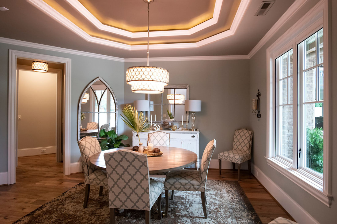 Lit by Pippin: Nautical Splendor Brightness (Lumens) – Intention Matters It doesn’t matter what color temperature the bulb is or how high its CRI if the brightness does not correlate with the intended activities for a space. A lumen (as opposed to a watt) is the measure of brightness of a light source. The higher the lumens, the brighter the light. Lumens are independent of wattage and different rooms require different levels of brightness. Light that’s too bright in relaxing spaces like bedrooms and living rooms will feel jarring and inhibit your ability to slow down and unwind. Likewise, lights that are too dim for areas of the home for daytime activities like an office, studio, or gym will feel uninspiring and lethargic. The way lighting is designed into your home’s structure will also affect its brightness. We like to put indirect lighting in relaxing spaces, such as cove lighting behind a trim piece in a tray ceiling, or wall sconces that shine directly up and/or down and not directly out into the room. The following are recommendations from the Illuminating Engineering Society (IES), the largest society of professional lighting designers, for number of lumens per square foot:
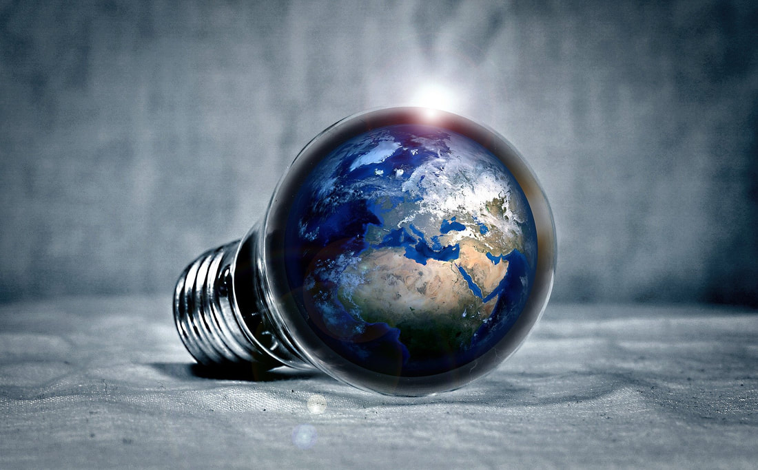 Photo credit: Pixabay The Legality of Lighting Because lights are now made to be more energy efficient while still able to produce high levels of brightness, many people are making the switch. In fact, as energy efficiency efforts worldwide have focused on the energy expenditure of lighting, the European Union, Australia, Brazil, and other countries have banned the less efficient incandescent and halogen lights. In May 2022, The Department of Energy issued a new ruling that requires lighting products to have a minimum efficiency of 45 lumens per watt. As a result, most incandescent and halogen products in the U.S. will be phased out by August 1, 2023. This poses an immediate issue with comfort level of lighting in the home. Based on the list above provided by the Illuminating Engineering Society (IES), this new ruling of 45 lumens/watt minimum efficiency will be too bright and uncomfortable for most of the rooms in the home. You might be surprised to learn the intended replacements for incandescent and halogen products have additional cons that affect your health and happiness. Join us next time when we dive into Earth-Centric vs Human-Centric Lighting and how the modern lightbulbs are designed for energy efficiency without considering the impact on human health. I intend your knowledge about lighting has been illuminated. Inspired by you,  Jenny Pippin, CPBD, FAIBD, CGP Pippin Home Designs 
1 Comment
9/6/2022 02:09:43 pm
Excellent article! This is a great series overall, but I LOVE how you broke this down. The light bulb section of most stores and also websites can be incredibly overwhelming to many people. I hope this info helps a lot of people make healthier choices for their homes. :) Leave a Reply. |

AuthorI am Jenny Pippin, founder of Pippin Home Designs and creator of my own inspired living. I grew up as an ordinary southern girl, working in the fields of my family’s tobacco farm. It didn’t take me long to realize I had greater gifts and so I chose to step into my power and create my own path in life, inspired by my heart’s true passion. (More on my personal story HERE!) Archives
February 2024
Categories
All
|
 RSS Feed

Copyright 2020. Pippin Home Designs. All rights reserved.
ARCHITECTURAL DESIGN COPYRIGHT NOTICE
1987-2024 Copyright. Jennifer B. Pippin FAIBD, CPBD. Pertaining to all home designs, drawings, and photographic imagery of completed designs
presented herein. No part of the contents of the design work presented on this website may be reproduced or transmitted in any form or
by any means, electronic or mechanical, for the purpose of replication or adaptation. This material is intended to provide accurate and
authoritative information about the design abilities and expertise of Jennifer B. Pippin FAIBD, CPBD and Pippin Home Designs.